We see them every day and they’re the famous logos of the brands we’ve come to know and love. Here are hidden meanings behind 10 of the world’s most recognizable logos.
1. Amazon
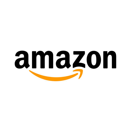
The yellow arrow in their logo starts at the letter ‘a’ and ends at the letter ‘z’, implying that they sell everything from a to z. The arrow also represents a smile, with the arrowhead being a stylized dimple or smile line. The smile indicates the happiness people feel when they shop with Amazon.
2. Picasa

Picasa, Google’s image organizer and editor, has an interesting logo mark. At first glance it looks like a simple camera shutter, but the negative space in the center of the shutter actually forms a house. This is because Picasa is considered ‘home’ for all of your photos, and casa in Spanish means home.
3. Apple

The name Apple all comes down to a simple explanation—Steve Jobs liked the sound of it.

The logo is in the shape of an apple because the company is named Apple and the bite mark is only there to give the logo scale—otherwise, people might confuse it for a cherry.
4. DC Comics

The new logo drew outrage from the fanboy crowd on the Internet, but was a bold move for the brand in moving towards a new direction. The logo itself features the letter “D” being peeled back like a page to reveal the letter “C” as a nod to the comics that started it all. DC also changes the logo’s aesthetic appearance to match whatever characters or properties the company is promoting.
5. Cisco

Cisco Systems is known for their telecommunication equipment, so it makes total sense that they’d choose a symbol that represents electromagnets for their logo.
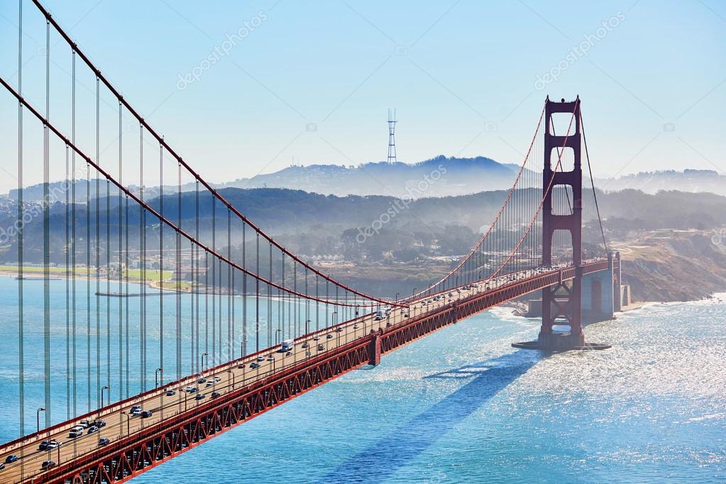
However, what many people don’t realize is that the electromagnetic waves are in the shape of the Golden Gate Bridge.
6. BMW

BMW’s logo colors come from the Bavarian flag, which are blue and white. Their logo is derived from the Rapp Motor Works’ logo, which is very similar.

It is commonly thought that the logo represents the blades of a spinning propellor, due to their aviation history and an ad created in the 1920s.
7. FedEx

FedEx is an incredibly popular shipping company, and its logo is plastered on trucks and planes all over. While there isn’t anything incredibly groundbreaking in the colors or simple type, there is a hidden gem in there. Have you ever noticed the arrow hidden in the negative space between the ‘E’ and ‘x’? The arrow represents the idea of moving forward with speed and precision, much like the FedEx brand.
8. Audi

Another car company with a logo with a hidden meaning is Audi. The four rings represent the four companies that came together to create the original Audi, Auto Union.
9. Google
/cdn.vox-cdn.com/uploads/chorus_image/image/47070706/google2.0.0.jpg)
Google’s logo is supposed to symbolize that they don’t play by the rules and know how to have fun. Instead of having a crazy font or symbol, they chose to relay their message with color. They stuck with the primary color palette, but broke it with a secondary color, green.
10. Pinterest

Pinterest got its namesake from the idea of ‘pinning’ things you like to a board. To further the idea of the pin, the ‘P’ represents a pushpin.

This brings together the real life aspect of tacking something to your wall and also doing it in the digital age.